Logo + headlines
Azo Super
Wide, bold, distinctive. This is the brand voice in shouted form. Used for the logo and any big stacked headline. Always uppercase, always inside the slanted black boxes.
Quick guide to making something that looks like B&D Moves. No design background needed. Four things to know: the logo, the headlines, the type, the photos.
The logo always sits flush to an edge of the page. Top, middle or bottom. Don’t float it in a corner with space all around it. Let the edge of the design hold it.
The simple rule:if there’s breathing room between the logo and the edge, move it closer until it touches.
Headlines use the same shape as the logo. Slanted black boxes, white letters standing upright inside. Stacked rows, hugged to one side of the page, flush to the edge. You pick what it says and where it goes. The only firm rule: a headline is always bigger than the logo on the same page.
The headline up close — same engine as the make page and every printed poster
Rule of thumb:if the headline doesn’t feel bigger than the logo on the page, scale it up until it does.
Type does the heavy lifting. Two fonts, each with a job.
Wide, bold, distinctive. This is the brand voice in shouted form. Used for the logo and any big stacked headline. Always uppercase, always inside the slanted black boxes.
Designed from the ground up for accessibility. Open letterforms, generous spacing, and clear differences between letters that often get confused (capital I, lowercase l, digit 1). It’s the font that lets the site read cleanly for everyone, including people with low vision or dyslexia.
Used everywhere outside of big display headlines: body copy, smaller section titles, buttons, cards. Sentence case (not all caps) for anything smaller than a display heading.
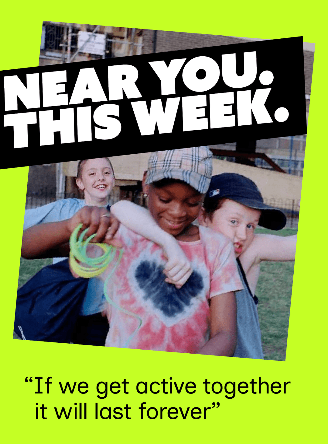
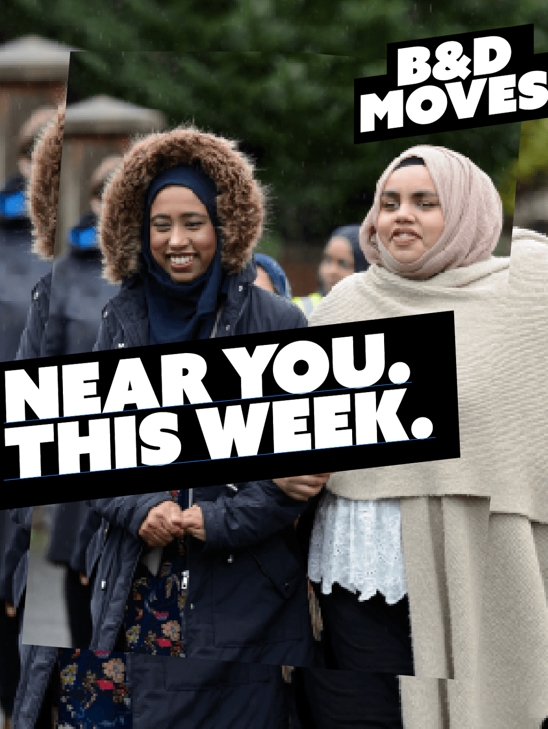
Photos sit at a slight tilt, roughly 8 degrees, always in the same direction. It keeps the brand recognisable. Use real, local photos. Cropped tight on people. Not stock, not from a distance.
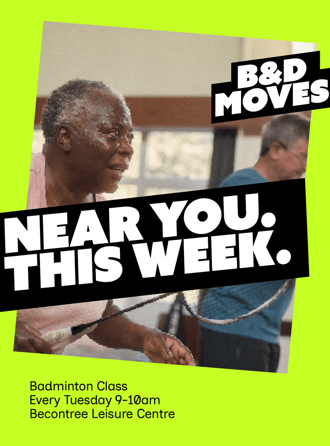
Just under 8° in one direction. Same angle, every time.
Three real B&D Moves posters. Logo flush to an edge, headline stacked and bold, photo tilted. That’s the whole formula.